southpier Posted March 26, 2015 Share Posted March 26, 2015 didn't want to put another thread off its rails. someone mentioned a builder whose work i was completely unfamiliar, so i searched. a few of the Gallery projects looked okay, but some quite ack-ward (sic). there must be basic tenets governing "good design". i mean, why would Fisher Body have had all those contests for budding designers if it wasn't to create pleasing shapes? the most jutting thing i see on Pre-WWII cars is a tilted forward grille frame with the top higher than the body's cowl. if the styling fails there, i can't get to the rest of the car. Q: is this quandary simply the inexperience of an untrained eye? i think Mr Green looks fine from the beltline down, but the windshield gets too wide at the top, and the folding top should be - well, done away. Mr Red - pretty much the same. i'm not a fan of leading with the tires, but the top and the bustle-back look truncated in proportion to the hood. before giving the camera blame, there are several other photos of each car online (right click the picture and select 'search Google for this picture'. am i the only person who ponders the possibilities ...? Quote Link to comment Share on other sites More sharing options...
wayne swayze Posted March 26, 2015 Share Posted March 26, 2015 I believe there are so many variations of what pleases the eye, that it boils down to individual tastes. Example: I love the green car, but the roof on the red car turns me off. To someone else, it's probably the other way around. Some builders of hot rods have established a "style" that lots of people like...eg Chip Foose, Boyd Coddington , George Barris etc. But if you like a certain car or builder's style, then that should be your choice. Wouldn't it be a drag if we were all the same.....(Jimi Hendrix). Quote Link to comment Share on other sites More sharing options...
chunkypeanutbutter Posted March 26, 2015 Share Posted March 26, 2015 Chip Foose cars have too big wheels. That's my only complaint. As for the Fords, I like them both. Built with care, built to ride. Quote Link to comment Share on other sites More sharing options...
Ace-Garageguy Posted March 26, 2015 Share Posted March 26, 2015 (edited) ... there must be basic tenets governing "good design". i mean, why would Fisher Body have had all those contests for budding designers if it wasn't to create pleasing shapes? Q: is this quandary simply the inexperience of an untrained eye? Multiple cans of worms here. I don't know of a brief, concise definition of "good design" as it applies to cars, but I know it if I see it. Things like proportion, interaction of elements of surface, volume and line, a coherent theme...all play a part. Functionality is important too. Something beautiful but useless has limited appeal. Also, much of "good design" is subjective, and skills develop over time. I look back at some of my own early work and think "that's awful" and instantly see things that could have been improved to make more pleasing shapes. Good design rarely comes from the first attempt on anything, either. Designs take tuning to look their best, committees don't do it well (usually) and there needs to be a willingness to be VERY critical of one's own design work to get visually appealing results consistently. I agree with you regarding the slight forward-lean of the grille-shells on most '32 Ford builds, real or in scale, and I usually change it on my own work. The "leading with the tires" look is somewhat due to the location of the front axle relative to the body / frame, and without major work, you're kinda stuck with it (removing the frame horns as in Mr.Red just accentuates it). Pushing the radiator-shell too far forward (blue car below) makes a goofy-looking car, appearing to be about to trip on its own tongue, and seriously unbalancing the proportions. I don't particularly like the rooflines on either of your reference cars above either. The sharp angle and upward slope at the rear of the soft-top is jarring to me, and the rear of the top on the red car is also too high in my eyes. The DuVall-style windshields are usually bought, not designed for a specific car, and the builders often just go with what they get. The look can be tuned to be more attractive, but it's time and money to get there. The windshield on this car doesn't have as much too-wide-up-top as your examples, but this one was most likely made specifically for the car. Here's a '32 with what I find to be a much more pleasing hard-top line, with the forward-leaning grille corrected as well. The width of the DuVall could be adjusted to good effect though. Very subtle changes work miracles. Here's a more pleasing line for an up-top on a '32...and though it's chopped significantly, the same profile could work on a taller top too. Adding carefully-designed additional bows, while somewhat complicated, can have remarkable results improving the flow of an up-top as well. "Stance", though a seriously overworked term, also has an instant effect on the initial perception of a car as being well-proportioned or not. Adjustments of as little as 1/4 inch of ride height, while not obvious to many viewers, can have an almost undefinable but instant impact on a car's look. Formal art and design curriculums exist, obviously, to, at least in part, teach the creation of "pleasing shapes". Art Center College of Design in Pasadena was for a long time THE place to go if you wanted to design in Detroit. Of course, the focus of a design-education is usually more along the lines of "industrial design", developing products hand-in-hand with marketing's perceived needs, and the blend isn't always successful. Here's an article from a January 2009 NY Times on just this topic. http://dealbook.nytimes.com/2009/01/31/defining-good-or-bad-design/?_r=0 Here's a design-by-committee, obviously, looking like it was designed by folks who had never seen a good-looking car, and had no idea of what that might be. "Good design"? No, but designed by "professionals" who get paid well enough to do better than this. It's entirely without harmony or theme, and every line, curve, surface and volume seems to have been mindlessly stuck-on by someone who hadn't seen the rest of the team's work. Edited March 26, 2015 by Ace-Garageguy Quote Link to comment Share on other sites More sharing options...
oldnslow Posted March 26, 2015 Share Posted March 26, 2015 Now that's fugly. Quote Link to comment Share on other sites More sharing options...
1930fordpickup Posted March 26, 2015 Share Posted March 26, 2015 Good Design is an eye of the beholder thing for the most part. I do agree with what has been said so far but that is just our taste showing through. Quote Link to comment Share on other sites More sharing options...
cobraman Posted March 26, 2015 Share Posted March 26, 2015 Good design is different things to different people. I for one hate the look of that Nissan Juke but I do see quite a few running around. Someone must like them. Quote Link to comment Share on other sites More sharing options...
Ace-Garageguy Posted March 26, 2015 Share Posted March 26, 2015 (edited) Good Design is an eye of the beholder thing for the most part. I do agree with what has been said so far but that is just our taste showing through. Good design is different things to different people. I for one hate the look of that Nissan Juke but I do see quite a few running around. Someone must like them. Yup. ...or... Same basic bits, just arranged and trimmed a little differently. Edited March 26, 2015 by Ace-Garageguy Quote Link to comment Share on other sites More sharing options...
Matt Bacon Posted March 26, 2015 Share Posted March 26, 2015 I've got quite a few friends who went to design school at Glasgow and the RCA, and a couple who even did degrees in automotive design at prestigious schools. Get them in a room together with beer and ask "what is good design?", and the conversation quickly splits into two factions. They'd say, "there are two kinds of designer -- car designers and chair designers" Tio exaggerate for effect, car designers designers apply visually interesting "skins" to a package below that is designed by engineers to do the jobs it needs to do. Chair designers create a a visually appealing form that also does the job -- art and engineering in one. Good designers can make things that look nice; great designers make them look nice and work as well as they possibly can. I guess I come down more on the side of the chair designers. Good design is not just about how things look. Given two choices that work equally well, then choose the better looking one. But if making something look a particular way makes it work less well, that is never good design. The greatest designs I can think of are the Mk 1 Spitfire, the E-Type Jaguar, the iPhone, Concorde, a Zippo lighter, Ferrari 275 GTB, Eames Lounge Chair, Dino, McLaren F1, the DC-3... I hate cars with fake turbines, rocket exhausts, fins that do nothing. I hate "stanced" and lowered cars that are undriveable. I think the i8 is probably the standout car design of this decade... YMMV, obviously... bestest, M. Quote Link to comment Share on other sites More sharing options...
Ace-Garageguy Posted March 26, 2015 Share Posted March 26, 2015 (edited) Good design... Horrible... Edited March 26, 2015 by Ace-Garageguy Quote Link to comment Share on other sites More sharing options...
jbwelda Posted March 26, 2015 Share Posted March 26, 2015 actually with all the regulations you have to mind these days, "design" for designs sake is a lost art. any "design" has to keep certain things in mind, passenger safety, streamlining to cut through the wind and thus increase gas mileage, bumper heights, junk hanging off that might decapitate passers by. with all that in mind the look of that Nissan suv starts looking better. still its the ugliest car on the road just about. jb Quote Link to comment Share on other sites More sharing options...
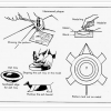
southpier Posted March 26, 2015 Author Share Posted March 26, 2015 i understand "design" is subjective, but there must be some accepted tenets from which to vary. perhaps the Ackerman of Styling - and grace - without which no things shall be conceived. http://commons.wikimedia.org/wiki/File:Ackermann_simple_design.svg Quote Link to comment Share on other sites More sharing options...
Lucas van H Posted March 26, 2015 Share Posted March 26, 2015 (edited) I personally like the type of cars that have been modified to some degree. Enough to notice something is different, but you just can't figure out what had been changed. For me, that's as good as it gets with real cars. I've seen dozens of cars with hideous spoilers, bodykits and what not, but I like the 'Less is more' approach more than the in-your-face mods. Lucas. Edited March 26, 2015 by Lucas van H Quote Link to comment Share on other sites More sharing options...
Harry P. Posted March 26, 2015 Share Posted March 26, 2015 There is no way to quantify "good design." One man's masterpiece is another man's disaster. I'm sure there are some people at Pontiac who thought the Aztec ws a good design... otherwise how could it have gotten the green light? This is simply one of those unanswerable questions. No answers, only opinions. Quote Link to comment Share on other sites More sharing options...
southpier Posted March 26, 2015 Author Share Posted March 26, 2015 I personally like the type of cars that have been modified to some degree. Enough to notice something is different, but you just can't figure out what had been changed. .... i think this is a perfect example: https://youtu.be/aC36gsaawWY not crazy about everything on the car, but the builder details why he reduced the frame rail depth and how that implies a channeled body, but retains enough room in the cab to actually fit (in those Oh, so comfortable aluminum seats!) Quote Link to comment Share on other sites More sharing options...
Mark Posted March 26, 2015 Share Posted March 26, 2015 The Juke isn't designed to look beautiful (and in that it succeeds), it's designed to stand out (and it succeeds there too). Every one a potential buyer sees is free advertising. If you don't like it, Nissan probably couldn't care less what you think because you aren't going to buy one anyway. They can afford to use a polarizing design because it's a niche vehicle; they'll sell every one they can build to the small segment of the populace that decides they like it. My nephew used to sell Nissans, he told me the Juke sold very well. Quote Link to comment Share on other sites More sharing options...
Tom Geiger Posted March 26, 2015 Share Posted March 26, 2015 (edited) Here's a design-by-committee, obviously, looking like it was designed by folks who had never seen a good-looking car, and had no idea of what that might be. "Good design"? No, but designed by "professionals" who get paid well enough to do better than this. It's entirely without harmony or theme, and every line, curve, surface and volume seems to have been mindlessly stuck-on by someone who hadn't seen the rest of the team's work. I wouldn't call it that. There is 'regional tastes' and this one was designed in Japan. And there's 'quirky' designed to appeal to a very narrow set of customers. This one fits both. There's enough of these on the road in the US to surmise that some folks like quirky. No different than a Nissan Cube or Scion box toaster thingy. And sometimes they are surprised by the market... these cars were aimed at, and bought by the youth market in Japan. In the US they are more popular with middle age folks. Edited March 26, 2015 by Tom Geiger Quote Link to comment Share on other sites More sharing options...
Ace-Garageguy Posted March 27, 2015 Share Posted March 27, 2015 (edited) There is no way to quantify "good design." But there ARE principles of "good-design", including the "golden ratio" noticed and employed by the Greeks around 2400 years ago...and probably much earlier in human history. http://www.geom.uiuc.edu/~demo5337/s97b/art.htm The cars, trains, jewelry... any objects designed by humans are far more likely to be perceived as being "beautiful" if principles of good-design are known and observed, than if they're ignored. I wouldn't call it that. There is 'regional tastes' and this one was designed in Japan. And there's 'quirky' designed to appeal to a very narrow set of customers. This one fits both. There's enough of these on the road in the US to surmise that some folks like quirky. No different than a Nissan Cube or Scion box toaster thingy. And sometimes they are surprised by the market... these cars were aimed at, and bought by the youth market in Japan. In the US they are more popular with middle age folks. And this is a perfect illustration of the point I was attempting to make. Thank you. The vehicle wasn't designed to be beautiful (a degree of "pleasing") but was done hand-in-hand with marketing to be "quirky" as you say, apparently, in an effort to appeal to a particular niche market. Marketing-driven design-by-committee rarely produces things of lasting beauty. The little frog-eyed Juke, looking like it's going to hop away at any moment, will surely be forgotten, or remembered as one of the "what were they thinking?" designs, like the equally awful Pontiac Aztek...another one that looks like no two parts belong on the same vehicle. Edited March 27, 2015 by Ace-Garageguy Quote Link to comment Share on other sites More sharing options...
Harry P. Posted March 27, 2015 Share Posted March 27, 2015 But there ARE principles of "good-design"... Yes, I know. My degree is in design. But even though I was trained in design, and know "good design" when I see it, that has no impact on anyone else's sensibilities. I could be a chef trained at the Cordon Bleu, but that's not going to stop someone else from thinking a Big Mac is good. Know what I mean? Quote Link to comment Share on other sites More sharing options...
Tom Geiger Posted March 27, 2015 Share Posted March 27, 2015 The Aztek was a marketing misfire. Pontiac thought there was a market for a quirky activity car turned occasional camper in the youth market. Problem was that most 4x4 SUVs already had that market and everyone knew this was a thinly disguised mini van. Never appealed to the intended market, if indeed their perceived market existed at all. I always said if I was to have an Aztek, I'd go all the way into quirky and get the bright yellow one with all the black out trim. It looked like an angry bee. Quote Link to comment Share on other sites More sharing options...
Harry P. Posted March 27, 2015 Share Posted March 27, 2015 All that cheesy black "cladding" that Pontiac was so gung-ho on (not only on Aztecs, but Bonnevilles, etc,.) was one of the worst moves they ever made. I would still love to know who signed off on the Aztec. And what they're doing today. Maybe they could team up with the geniuses who came up with "New Coke" and start a company called "Stupid Ideas, Inc." Quote Link to comment Share on other sites More sharing options...
Ace-Garageguy Posted March 27, 2015 Share Posted March 27, 2015 (edited) Yes, I know. My degree is in design. But even though I was trained in design, and know "good design" when I see it, that has no impact on anyone else's sensibilities. I could be a chef trained at the Cordon Bleu, but that's not going to stop someone else from thinking a Big Mac is good. Know what I mean? Exactly, and that is a very important point and a distinction it's necessary to make. "Personal taste" and objectively analyzed good-design are two entirely different measuring approaches. Just because someone happens to "like" something, that doesn't make it a "good-design". And if someone doesn't like something, that doesn't make it a bad design. I know it's impossible to exactly quantify "good design", but we can certainly say that some designs are "better" than others, based on how well the designers understood and employed the principles that are their primary tools. Edited March 27, 2015 by Ace-Garageguy Quote Link to comment Share on other sites More sharing options...
Mark Posted March 27, 2015 Share Posted March 27, 2015 Anyone I talked to who owned a Pontiac Aztek liked it. I wouldn't touch anything GM with a ten-foot pole (then or now), but the people who bought Azteks liked them. Apparently, there weren't enough of those people though. It, the Nissan Cube, the Juke, and others aren't "cars" the way most of us here think about them. We might describe them as "transportation appliances". They serve the purpose for the people who buy them. Twenty-five years from now, well-preserved original ones will turn up at car shows just like clean Pacers and Volares do now. Most of those "worst/ugliest cars ever" articles are written by people who think of "cars" as being those yellow things with a light on the roof, that pass them by while they walk to the subway every morning. Quote Link to comment Share on other sites More sharing options...
drball Posted March 27, 2015 Share Posted March 27, 2015 A former coworker of mine was a summer hire at the American Motors plant in Kenosha when they changed over tooling and started rolling out the new Matadors in the 70's. He recalled the full time employees were somewhat desponded because they believed the new design was ugly and soon they would cut shifts and have layoffs. Quote Link to comment Share on other sites More sharing options...
southpier Posted March 27, 2015 Author Share Posted March 27, 2015 .... I could be a chef trained at the Cordon Bleu, but that's not going to stop someone else from thinking a Big Mac is good. Know what I mean? yes; some peoples taste is all in their mouth Quote Link to comment Share on other sites More sharing options...
Recommended Posts
Join the conversation
You can post now and register later. If you have an account, sign in now to post with your account.
Note: Your post will require moderator approval before it will be visible.