

galaxyg
-
Posts
211 -
Joined
-
Last visited
Content Type
Profiles
Forums
Events
Gallery
Everything posted by galaxyg
-
This is fantastic, and the roof being body colour, change of wheels and the addition of the front lip and wing make it look so much better than the standard model. And you had this on the cover of the Tamiya Model Magazine. Bravo!
-
Presented in chronological order. My top 3 favourites would be the JACCS Accord, the Lamborghini Murcielago and the Ferrari 612 Scaglietti.
- 23 replies
-
- 10
-

-
Merry Christmas and a Happy New Year to you all. Here's the last of my year in 1/24. Background: I bought this kit in a small town called Kitakata a long long way from Tokyo. Walking along the Kitakata streets in the pouring rain I saw a toy shop on the other side of the road and thought "there are stacks of white boxes at the back of that shop, I wonder if they are model kits?" Almost like some kind of kit radar. The shop was run by an elderly Japanese couple who were no doubt surprised by the sudden appearance of a foreign tourist and given the location and conditions, perhaps the only customer that day. A happy discovery as they had one of the kits on my list - this Honda Fit; I didn't see another in any other shop on the entire trip. It was here - by lucky chance - or nothing. The Honda Fit / Jazz is something I'd describe as both a quintessential Japanese car and a quintessential Honda. Small and clever. There was a time when it was Japan's best selling car. The kit itself is something of an oddity for Tamiya - released in both motorized and non-motorised versions (only the chassis is different, and the motorized version has a driver figure), the engineering of the kit is certainly not their usual style even if it is their usual quality. Even the box is different, using different fonts and without the usual front/rear/side elevation illustrations that Tamiya boxes have along the sides of the box. This seems to be the the last ordinary everyday car that Tamiya made a kit out of. Pros: Good proportions - looks exactly like a Honda Fit / Jazz. Very easy to build and comes with it's own fuzzy carpet for the interior. In particular the headlights are a joy to assemble, they're so well thought out for the builder. Very well moulded, little cleanup required. Rear lights are moulded in red, another plus. Cons: Curbside - no engine. The front wheels don't steer, and there's a lot of masking to be done for the windows although masking seals are provided although not die-cut ones, you have to cut them out youtself from the printerd pattern. The body is moulded in red as are the number plates - ugh. No real-life number plate decals supplied either. Verdict: It's a quick and easy build, looks exactly like a Honda Fit once completed. Great stuff. Build notes: Built over the course of only 6 days in December 2023, painted in Volvo Orinoco Blue, clearcoated with Mr Hobby Premium Gloss. Aside from the front and rear Honda emblems and swapping the number plates, the rest is out-of-the-box.
-
 Background: I had planned to build a rally Subaru Legacy at some point - I love the feel that it has the appearance of an ordinary saloon car with a rollcage in it and the backseats removed. There are many liveries to choose from, I thought this one would make a stand-out version on the shelf being a yellow base instead of a white one. Pros: Good overall shape, more or less fits together well. Decent underbody and interior detail. Comes with photo-etch for details and material for seatbelts and mudflaps. Cons: The supplied tyres (which I have changed) seem much too large and make the car look and ride like a tractor. The glass doesn't fit perfectly. The headlights are buckets and lack detail and the headlight glass doesn't have a very positive fit. The interior is a tub with many details moulded-in and the door cards are flat and too simple. There are quite a few ejector pin marks to clean up, and separation lines too. As the car shares it moulds with the road version, some work is needed to open up the holed for the roof vents. Verdict: It's OK. Not great, not terrible. Not up the standards of Hasegawa's more recent kits. Build notes: Built over the course of 8 weeks in October/November 2023. The only change to the boxed kit is changed tyres and changed seatbelt harness material - paper instead of whatever that stuff is that Hasegawa provide. The mud/dust is applied using weathering pigments. The instructions would have you fit only one door mirror, the photo on the box shows none. Neither of these look right to me, so I fitted both.
 -
Aoshima Honda Odyssey Absolute
galaxyg replied to shoopdog's topic in Model Trucks: Pickups, Vans, SUVs, Light Commercial
Very nice. A good looking elegant car in real life too. Great colour. -
Sweet. The wheels really suit it.
-
Thanks. It's such a good kit, despite it being around 40 years old, the only tips I can offer are 1) to make sure you carefully identify all of the mould lines on the body and remove them. There are quite a few and some are very subtle until you've got the body colour on. 2) Electrical tape is very useful for the red stripes down the sides.
-
Background: The Honda Ballade CR-X Mugen Pro is small, light and very 1980s, especially the wheels. It'll fit well with my Honda collection. Pros: Nearly all fits together well, looks great. Good rubber tyres and quick/easy to build. Doesn't take up much space on the shelf. Cons: This re-release kit shows it's age in a few ways: There's a fair few mould lines to clean up from the roof and bumpers; the seat backs are hollow, and there's a thin line right down the middle of the back window where the molten plastic has met from either side. In addtion, there's very little positive mounting for the dashboard and the wheels are a little wobbly once put on the car. The interior lacks some detail, especially the door cards. Some window masks would have been nice. Verdict: It's pretty good considering it's age. A nice quick, simple build of a classic. Build notes: Built over the course of 3 weeks in September/October 2023. Painted in Tamiya TS-76 Mica Silver, clearcoated with Mr Hobby Premium Gloss. The seats are Tamiya TS-49 Bright red. The only changes to the kit are the addition of some interior carpets, some mesh in the front grille and the front Honda emblem.
-
This is fantastic and the photography is amazing.
-
Beautiful. Especially the colour.
-
Background: I'd been waiting for one of these uncommon kits to show up on ebay for a while, and this August it finally did, so it went straight on the workbench. I don't build many US cars but the Pontiac Fiero is one I was certainly interested in, being such an unusal car for GM and having decent-from-many-angles styling. I wanted to try something a little different from my usual, and it was also the first Monogram kit I'd bought and I was interested to see how it compared to AMT in terms of quality. I've still not built (or owned) any MPC kits yet for a different comparison. Pros: Most of it fits together very well. The glass is practically snap-fit (hurrah), and the chassis and the body have a perfect snug fit where the wheel arches go all the way up to the body, no gap as per many kits. There's a nicely detailed engine and the seats look good once finished. The glass is nice and shiny. Cons: The wheels don't steer and for all four wheels, they won't stay on without something beyond what is supplied. There's a lot of flash to clean up from many parts - especially the seats. There are no side windows. The door mirrors have no decent mounting points. The decals are few and pathetic. Some of the transmission and axle parts are warped and need a lot of glue and coaxing to sit well. There are many chrome parts and the chrome is unrealistic and basically demands stripping. No option to pop-up the headlights. The exhaust tips are clumsily not-very-round. And finally - the worst thing, it's entirely moulded in red - even the interior and engine - the worst colour to cover with paint. Except the two cam covers - these are red on the real Fiero, but Monogram have chromed them. Verdict: It's pretty good considering it's age. I was expecting a lot more trouble getting it to fit together - probably based on my experience with an AMT kit. So though it requires a little work, there's nothing tricky about building this at all. The end result looks very Fiero. Build notes: Built over the course of 3 weeks in August 2023. Painted in Hycote Vauxhall Caribic blue acrylic and clearcoted in Tamiya Clear. Aside from the seatbelt retainers, carpets and the custom number plate, it's built entirely out of the box. All of the chrome parts have been restripped and where applicable (such as the wheels) repainted in Tamiya Metallic Silver.
- 29 replies
-
- 15
-
-
The side rubbers - magic marker. And the rear lights - Hasegawa self-adhesive mirror finish. Clear red on lenses - this stuff is great. Weathering the underside. Fitting the rest of the rear end. There's no real positive fitment for the wheels insofar as the stub axles are a lot thinner than the inner wheel holes. They don't sit straight and as soon as you pick up the car, all 4 wheels fall off sideways like a clown car. What it looks like with other wheels. 100% more "cool" but 100% less 1985 Fiero. Back to the Fiero wheels - a blob of bluetac helps sort the fitment and retention issue. The supplied decal for the plate was awful so I've used one I had printed last year with my initials on it (MFH) and the year of my birth (73). Why Florida? It looked distinctive with the two oranges. And I was also able to find artwork for it. This is the last pic from the WIP.
-
Clearcoated and polished body. Masking off the rear and sides. Inside of the engine cover.
-
Background: I bought this kit on holiday in South Korea in 2011 and it stayed in my stash for 12 years becasue the complexity of the decals put me off. It's by a few years the oldest kit in the stash so I finally decided to tackle it as one of my planned "5 challenge builds" in 2023. Pros: It all fits together very well and as usual for Tamiya is crisply moulded with plenty of detail. Very nice soft rubber tyres. Great interior and underbody details. Cons: The idea of using decals for all the red, orange and green is at best, optimistic. As some of the logos are printed in with the colour, this makes choosing the option of painting these ares even more difficult - 100% separate logos would have been preferable so either approach could be taken more easily. The same goes for the blue sawtooth edges. Also the black decals destroyed themselves on the whole, although that's more age related and anything else, I presume. No engine, as usual for most of Tamiya's race cars. Verdict: In terms of building, great. In terms of painting and decalling - it's about as difficult and complicated as kits get and an exhausting build for the sheer number of hours that have to be put into it. Nonetheless, once that time has been put it, it does look very good and very striking sitting there on the shelf. It is a fantastic livery created with no regard for the poor modeller recreating it 29 years after the car won the championship. Build notes: Built over the course of 7 weeks in June-August 2023. All of the red, green and orange areas are masked and painted, the complex curves and louvres around the bumpers made this a better option than using the supplied decals. The number of the car has been changed due to the number 14 decals shredding themselves as they came off the backing sheet. A driver figure (also Tamiya) has been added, and the bonnet pins are photo-etch, not the supplied decals. A few other black decals have been changed due the originals shredding. The Honda logo on the grille is a 3rd party item, the Tamiya decal fell apart.
-
The beginnings of the dashboard. The interior of the Fiero is made out of multiple shades of grey plastic, carpet, fabric and different plastic, with black and silver all over the place too. Mine will reflect this, and at least it's visually more interesting that "Paint all parts semi-gloss black". The floor is very lightly textured so I use my usual technique of sandpaper spraypainted for the more 3D texture. Door handles are separate parts. I make these the same grey I plan to use for the seats. Final carpets. The seats are covered with flash and the fronts and backs fit with a very noticeable seam. The following pics are me dealing with that, with several rounds of primer and filler until eventually complete, sprayed grey and then oversprayed with Mr Hobby Matt. The sides of the seats will be very visible through the non-existent side windows, so important to get them looking good. The probably completed interior. I might add some seatbelt retainers. I didn't take any good pictures of the engine as I was building it, so here are two of it completed. I can just imagine the conversations in the Pontiac marketing department... "Let's make it red". "Yeah". "Yeah...". "Then people will think it's even more like a Ferrari". "Yeah..." Clearcoating the body with Tamiya clear - my last can and something I plan to stop using for this very reason - it's reactivated the week-dry paint on this one bit of the body only, so I'll have to respray that little be and re-clearcoat. I will stick to Mr Hobby clearcoat in future. Test fitting body, interior and chassis. It all fit very perfectly. No warp. No gaps. No fuzziness or vagueness. Very nice.
-
The rear bumper was my test part for how happily Tamiya Mica Silver and Hycote Double Acrylic car paint would play together. As it turned out, very happily. In fact the Hycote paint goes down very well indeed. Not quite a smooth as Tamiya TS paints but pretty close. Priming the body Silver body undercoat. With the lower body masked off the top coat goes on, in some very warm summer weather to help it dry. There are 4 thin coats here and that covers it very well. Masking removed. That mark on the door is a bit of dust, not a paint fault. Baking in the sun. From top left. 1. The horrible chrome wheels. 2. After 5 minutes in Mr Muscle over cleaner. 3. Primed and then painted in Tamiya Gloss black. 4 Final paint in Tamiya TS83 Metallic Silver. At this point I'm leaning towards using the kit wheels, so I want them to look as good as they can compared to any other possible choices.
-
I've been waiting a couple of years for one of these to come up for auction *and* at a price I was prepared to pay. That time was this Monday just gone, and by Saturday it'd arrived and was on my bench. This is my first Monogram kit experience and only my 4th American car from what is now 124 builds. I like the look of this car even though it's reputation, engineering and sales never matched up to the promise of the idea, although I think Pontiac nailed the exterior styling very well. That could not be said of the interior. Near the end of it's life when GM made a load of improvements, then cancelled it shortly after. The box is a bit beat up but the kit inside is all good. I may keep these nice period wheels but I've seen photos of the Fiero with bigger rims and it does take them very well. Almost everything is moulded in red. The worst colour to cover up. There's a horrible chrome tree with - ironically - two engine parts that are red on the real car, but chrome in the kit. Go figure. There's also the worlds most pathetic decal sheet, and some hard vinyl tyres as well. Looking at the unassembled kit you can see Monogram and Revell were kindred spirits even before they were joined as companies. Lots of detail including where it can't be seen. Dodgy moulding and fitment, horrible tyres, no brake discs, two-piece wheels, front wheels that don't steer. The car will be this colour - Vauxhall* Caribic Blue from a rattle-can from. The bottom 1/6th of the bodywork will be silver - there's a natural split line and I've seen quite a few pics of these two-tone Fieros. *for USA readers - Vauxhall is the brand name under which GM sold cars in the UK, so this is - at least - a GM colour. Vauxhall was sold entirely to the French a few years ago leaving GM with little presence in Europe at all. Sink marks that need attention. There is a choice at this point - side scoops(on the left) or side louvre/vent. I will go with the louvre/vent. The underbody is quite nicely detailed and looks a lot nice once it isn't red.
-
Background: The Toyota Altezza / Lexus IS200 is a car I'd long wanted to own but since I don't cycle through cars on an annual basis, never did - I had other cars instead. I'll have to settle for a 1/24 version instead, what a pity the only one available is from Fujimi's "it'll do" era of kit output. I found a real-life metallic red one online so was inspired by that in my colour choice - something I was uncertain with after the paint went on the car body but fully happy with again once the build was nearing completion. Pros: The exterior is a good shape, it captures the proportions of the Toyota Altezza nicely. It's also moulded well with little cleanup required and decent panel lines. At least 75% of the kit fits together very well. The door mirrors have solid glueing points, as do the seats. The satin chrome parts are a good finish. Window masks are supplied. Cons: Despite having a good finish, the satin chrome part's moulding looks scruffy. The chassis is very very basic and lacks a lot of detail. The wheels and tyres supplied with the kit are too small. The glass is too thick and not shiny enough - even with polishing. The interior is fairly basic and the dashboard moulding is a bit rough. The steering wheel is too thin. The front bumper needs a lot of effort to stay in place because it only has tiny glueable points, and the rear bumper needs reinforcement also. The front headlights have only a vague fit to the body/bumper so need a pile of PVA glue to hold them in place. Both mesh-areas on the front bumper are moulded-in. The brakes and hubs are a bit flimsy and fiddly. Curbside - no engine. Verdict: It's far from a good kit, and yet as is often possible with the Fujimi "it'll do" line, a good looking result is possible with effort. Providing you don't look too hard inside and don't look underneath at all. Not for beginners. This build is better than the kit, and the photos are better than the build. Build notes: Built over the course of about 4 weeks in July 2023. I've changed the kit wheels to Fujimi's 18" OZ Racing SuperTurismo, removed the solid mesh from the front grille and lower air intake, added some detailing behind the upper mesh and used my own custom-printed number plates (matching the year of build, 2023). I've also added a black front lip and side skirts. The silver OZ Racing decals on the sides are 3rd party also. The colour is Tamiya Pure Metallic Red over Tamiya Metallic Red over Tamiya Bright red, over pink primer. I had a load of spare red to use up.
-
Very nice. Candy Lime green is a great colour for mad cars.
-
Background: Here's one Ferrari that doesn't look so great in red. It's one big, elegant, beautiful grand tourer but I can't think of another car where the choice of colours and wheels make such a difference to it. Wrong choices and it just looks big, bland and possibly ill proportioned, and I've always dismissed it as a result. Right choices and it looks like something a whole lot better and the sense of the car's styling shines through. I chose to make a two-tone car a little like the Sessanto versions and change the wheels too. I also got a photo-etch pack from Hobby Design. The overall level of effort, detail, Revell-isms, PE and the bespoke mask-making make this number 2 on my planned "5 challenge builds" for 2023. Pros: A huge amount of detail, a well detailed engine and very tidy interior. Lots of hidden details too mean that if you build this kit, you'll have a good idea of how a real 612 Scaglietti is under the skin. It's a nice strong, tough model even before assembly. The front and rear windscreen fitment is from the outside and a very good solution. Overall proportions look good. Most of it fits together easily. Cons: The supplied wheels and tyres are horrible, and look out of proportion. The tyres are also a bit plasticky and the wheels are chromed - and the entire chrome sprue is horrible. The brakes are weak with flat, almost 2D calipers. The body doesn't fit perfectly onto the chassis, there's no positive mounting and little scope to glue either: this is a typical Revell problem. The bonnet doesn't perfectly close without something to hold it down. (Blu-tack in my instance). More than 50% of the kit is moulded in red and it's a horrible colour to cover. Red engine, red seats, etc. Some of the parts fitment is a little vague and/or small contact areas for the glue. The instruction sheet has some omissions and errors in part numbers. Revell's flappy-end box is annoying. Verdict: Mostly good, it's a nicely detailed model with overall decent fit, the worst parts are the tyres and wheels and they are better if just replaced. Built as-it-comes and it'll be fine. With changes and extra detail it's very very nice indeed. Build notes: Built over the course of about 4 weeks in May/June 2023. I've changed the wheels, tyres and brakes for those from a Fujimi F430 kit, and they improve the appearance a lot. It's painted in Tamiya Metallic Black and Tamiya Light Gun Metal, with a Tamiya AS-22 Dark Earth interior. There are many photo-etch additions from the Hobby Design set, most of which are on the interior however the one that makes the most improvement is the replacement front grille. The hub-centre emblems and front and side emblems are 3rd party, and the rear Ferrari horse is Tamiya. The number plates custom printed. The 50-MH-23 number plate is specific for this build using Portugal plates as they fit the format of the build's significance: 50 - the age I will be 2 days after completing this. MH, my initials. 23 - the current year. As a 50th birthday present to myself, I am very happy with this build. It's certainly going to be one of my 3 best/favourite of 2023, and it'll stay in prime display position for quite a long time. I have a new and strong appreciation for the 612 Scaglietti now - and as such there are a few more photos than usual.
- 19 replies
-
- 10
-
-
Nice recovery. I hate it when that "gluey-fingers" thing happens and it does at least every 10th build for me. I have the Aoshima kit of this car - different mouldings to the Fujimi one - better - but less good than the much newer Hasegawa one. For what's not exactlly a super well known classic race car, three manufactuers have all had a go at making it in kit form.
-
Thanks. Ford's own brand, bought in a rattle-can from the local Ford dealership parts department. Sprayed directly out of the can and onto the kit.
-
Tamiya Toyota SARD Supra
galaxyg replied to galaxyg's topic in Other Racing: Road Racing, Salt Flat Racers
Yeah, kinda an earlier version of that type of thing. -
Tamiya Toyota SARD Supra
galaxyg replied to galaxyg's topic in Other Racing: Road Racing, Salt Flat Racers
Thanks. SARD is the name of the racing team. -
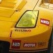
Background: Aside from it's original smaller darker wheels, I think the SARD Supra is a great looking race car - with some improvements. Shame Tamiya didn't make kits of the later versions from the same team. Even in this kit I see room for both a bit of extra detail and some changes to make it more my taste. Pros: Good clean moulding and easy fitmet as usual from Tamiya. Fantastic transparent parts, so very very clear and shiny. Cons: The front wheel arches are separate parts and whilst this makes masking easier, the contact area is pathetically small and they did ping off about 5 times during the build. Eventually I had to reinforce them. The glass parts have very little contact area with which to use for gluing them. The red parts of the car are optimistically supplied as decals. There is no engine. Not Tamiya's fault: The original car is a bit sparse on decals - like they could not find enough sponsors. Verdict: Mostly excellent aside from the few things mentioned in the cons section. It's one great looking race car. Build notes: Built over the course of about 4 and a bit weeks in April/May 2023. All of the red areas are masked and sprayed, the fiddly red decals remain unused. I've changed the wheels to Aoshima Enkei NT03+M, added a driver with seatbelts, some PE bonnet pins and added some wiring and hoses to the interior. I then used a second identical set of decals to add another AISIN to the rear wing, another Toyota/Mobil 1 to the roof, some decals to the rear and rear quarters and then used some 3rd party Sanyo decals to fill up some of the white space on the doors. All these changes make it look (to me) a much more "complete" looking race car / livery. Like so many cars I've built that have a lot of white, I always feel they look a bit grubby at the end. Even if cleaned.
