Russell C
-
Posts
1,931 -
Joined
-
Last visited
Content Type
Profiles
Forums
Events
Gallery
Everything posted by Russell C
-
 I'm inspired to drop by the crafts store to get the faux rock spray cans system so I can paint my 1:1 cooler to look like it was carved out of solid granite. ?
 -
Let's see your geegaws!
Russell C replied to Lunajammer's topic in General Automotive Talk (Trucks and Cars)
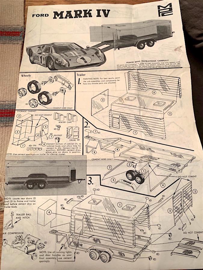
Over in the "Show us your glue bombs" thread it turns out I utterly mistook a quick glance at an MPC logo and thought it said IMC since I was more dazzled by the car I had just gotten. Haven't seen the actual pieces, but in some old version of the MPC GT40 Mk IV, they included a storage cabinet, water cans, oil drum & oil cans, a fire extinguisher, bucket, air compressor on a two-wheel tank, and an entire clear plastic-wall two-axle transport trailer.
-
Let's See Some Glue Bombs!
Russell C replied to Snake45's topic in General Automotive Talk (Trucks and Cars)
Eeeeeeek. One of these days I'll learn how to read. Hokey MPC logo lettering, yes, but I think where really I led myself astray was seeing all the white-molded plastic in this bomb when I was expecting red. MPC must have done an older one than the red plastic version, and this instruction sheet has all of its first page dedicated to a transparent walls two-axle transport trailer. My other excuse besides boneheaded random bouts of illiteracy is that I'm a traditional model builder --- don't need instruction sheets, never read 'em. ?? Nice pics & models! Naw, this suits my purposes purely because of how cheap it was, and all I needed was just the center body section. Mix 'n match guy that I was (Chrysler / Lambos, Cadillac BMWs, etc) and would like to be again, this one was a gamble to see if its body compared in scale to another glue bomb donor of front & rear clips, and since they all line up good enough for jazz, this project will be headed where no LaMans car has gone before. ? -
Let's See Some Glue Bombs!
Russell C replied to Snake45's topic in General Automotive Talk (Trucks and Cars)
Cheap IMC GT40 Mark IV on eBay with free shipping. Sort of a fun metallic gold color. I initially thought the ebay photos were showing a red molded MPC kit with scratch-throughs down to the bare plastic, but it turns out the builder sprayed the gold over a pink-ish red primer coat. I hope it all dissolves fairly easily. This one really earns the word "glue" in gluebomb, the back wheel really was solidly in that position and didn't come off without a struggle. The fiddley suspension looks like it was a huge struggle for the builder who might have abandoned it at that point because not enough glue would hold it in place. In one of the other threads here about GT40s, somebody said you can never have enough of them, and since all I had was just a pair of 64th scale die casts, I needed this one. Well, maybe just the central body / interior section. The ultimate objective is to mash that section together with another ironically gold-colored glue bomb I snagged and have a complete car to mess with my fellow modeler's minds, where they might say "that isn't like any LeMans car I've seen. But the front & back clips look really familiar ……"
-
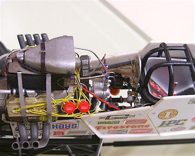
Not being an expert in old Revell kits, is that same engine shared in the Eddie Hill Pennzoil dragster? Way back in the late 1990s, I committed the crime of lopping one entire cylinder out of it. Put the cuffs on me.
-
Never had any experience with one of those. It'll still run fine on the gas engine, right?
-
Well …., what happened here is you sent the 3rd party outfit a BMP file, and in a technical sense they sent you back a PDF file with a bitmap image in it. When you don't have a vector art program to view the artwork, you'll never see what it truly looks like. There's literally no reason at all to send you a PDF file other than to provide something that you could open up in Acrobat Reader to see what it will approximately look like, and Acrobat may have actually sharpened up as you zoomed in just for computer screen clarity, which doesn't really mean anything. What you needed was the vector file alone to send onto the decal printer. Back when I worked as a graphic artist at two places that created photo etched / cast metal decorative items / nameplates, the two kinds of file types that I hated to receive were BMPs, JPGs or TIFF photo files with their inherently unclear pixelated edges, and PDF files of corporate logos with their own inherently unclear pixelated images. Whenever I could, I urged our sales people to go back to their customers to demand that the artists they used share the original vector files for what they wanted us to reproduce, otherwise our place would have to create the vector files we needed at extra cost to our customers to ensure a super crisp product result. When our salesmen couldn't get our customers to deliver, we were often under a mandate to use the pixelated images as best we could to save time and expense on our part, and the results were always crumbly to some extent, depending on what extent we could put into sharpening the images via photo alteration - contrast /color adjustment, etc.
-
Not understanding your first bit, and maybe I'm out-of-date on my graphics knowledge, but vector files are vector files. Adobe Illustrator, CorelDRAW or some new variant that the industry has come up with lately that works identically. What is "vectorized PDF"? I've turned text pages with photos and graphics drawn in my CorelDRAW program into PDFs just so I could email them to people to read, but I'd assume that means an automatically loss in quality to some degree, which is irrelevant to somebody printing out my page (a resumé or whatever) on the other side of the country to share with other folks. When it comes to ALPS printing, you might have a very large and unfair generalization there. In the two or so decades I've heard about it, I don't think I've ever heard anyone say the quality of printing was substandard. What you might have in this instance is a single faulty printer and/or an operator who didn't run the machine correctly or did something to the artwork. If the file got degraded in some way, that would only make the problems worse.
-
Huge losses to the modeling community
Russell C replied to bobthehobbyguy's topic in The Off-Topic Lounge
Yes. Wow, forgot about your old video. At the 4:20 point as Pat Bibeau is talking, there's the late Tim Pentecost right nearby, followed by the late Augie Hiscano at the 4:32 point. The late Andy Kallen is at 41:52, all towering figures in GSL history. -
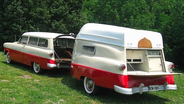
Took me a while to remember what your combo sorta reminded me of -- the much less racy Kom-Pak 1:1 camping trailer with the upside down boat on the roof. Fun link about these here. Yours is much more nifty looking!
-
Really nice choice of color!
-
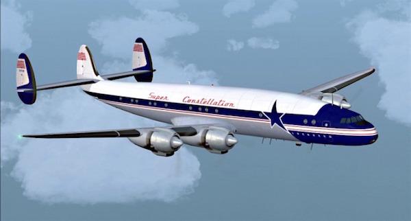
Always liked the looks of Super Constellations. Plus, if one big old piston engine sounds great, why not have 3 more of 'em?
-
Mcleans International
Russell C replied to The Brush's topic in Model Trucks: Big Rigs and Heavy Equipment
If it weren't for the base and background sheet, we could be fooled into thinking these were photos of the 1:1 rig! -
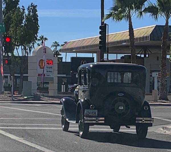
What did you see on the road today?
Russell C replied to Harry P.'s topic in General Automotive Talk (Trucks and Cars)
-
A.k.a. the "Zamac tragedy" http://www.modelcarsmag.com/forums/topic/155243-zamac-tragedy/ If I hadn't gotten straight Ds in chemistry, I'd have more fun finding out how that zinc alloy breaks down. "Zinc Pest" is part of the problem in zinc casting, and this alloy was supposed to cure that, but the cure only works so long as metal casters don't toss junk scrap into the molten metal mix.
-
It's a Detroit Diesel, I thought it had much better detail than the AMT versions. But now, as it relates to the production years of the 4070As, a couple of questions to cure my senility about them: what year did that style of Alcoa Front Runners first come out? And what's the name of the 10-holes that were just an overall dome shape in cross section, no raised flat area for the lugnuts? That style from an AMT kit is what I put on my ancient history build of this kit.
-
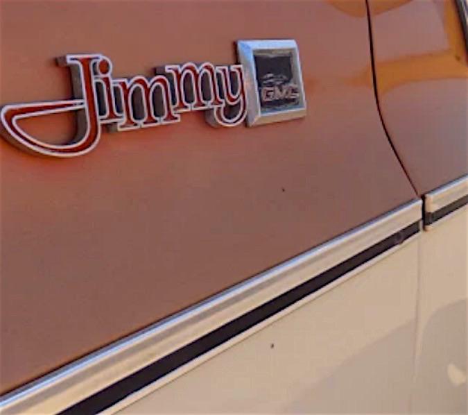
Chevy/GMC side molding
Russell C replied to Vince311's topic in Model Building Questions and Answers
That's actually a tough question, particularly if you are aiming for real accuracy. It could be done with double-etched stainless steel, where the partway down etch creates the channel that you'd have to fill with black paint (unless you were building a 1977, where that trim had yellow paint for that model year only). The rest of the etch would cut all the way down through the metal to give you the separate pieces you need. Problem is, you'd have to hire somebody to do the artwork and actual photoeching, which involves quite a bit of meticulous measuring to get it to fit on your model just right. I used to work at a nameplate manufacturer that also did aerospace quality photo etching, a person needs to calculate what amount of oversize the artwork needs to be to compensate for double etching relative to the thickness of the metal, since that involves eating away the outer edges of the metal twice. I've wanted to build a '76 GMC Jimmy factory stock for quite some time in the High Sierra trim level, but the one barrier to accomplishing that project is how to do this exact kind of trim. In 24th scale, these would be really delicate pieces.
-
Sneaky Pete truck.
Russell C replied to Oldschool297's topic in General Automotive Talk (Trucks and Cars)
Basically a mid 1970s Chevy pickup stepside, but with the custom front end. Never saw if this was based on a 1:1 custom truck. My one gripe with the kit is that if it was supposed to mimic a Peterbilt truck, it should have had the headlights in pods coming off the radiator shell. I wonder if the 32nd scale headlights from a Monogram Freightliner might be size-appropriate for this kit to get that Peterbilt look. I'd think the lights from the 25th scale AMT Peterbilt would be too large.
-
64 Dodge D100 Pickup Pro Street
Russell C replied to AmericanMuscleFan's topic in WIP: Drag Racing Models
I should have guessed! Back when I was a graphic artist at a nameplate manufacturer, we used CorelDRAW and film sheets for photoetch artwork and MetalPhoto processing, so somewhere around here I have leftover strips of 25th scale 1960 Cadillac gauges that I placed in the otherwise unused outer boundaries of the film sheets. -
GSL Common Kit: [revision] just another Model A Roadster
Russell C replied to 89AKurt's topic in WIP: Model Cars
There's an idea. But if one is good enough, more cylinders might be better. Soap, soapstone, fake kitchen countertopstone, that's our man! -
Oops. https://www.youtube.com/watch?v=BTxEEKDkeu4&t=80
-
GSL Common Kit: [revision] just another Model A Roadster
Russell C replied to 89AKurt's topic in WIP: Model Cars
Sleight of hand might need to be involved. Inlines sometimes don't point in the direction folks expect them to. Sky (line)'s the limit in some cases. -
GSL Common Kit: [revision] just another Model A Roadster
Russell C replied to 89AKurt's topic in WIP: Model Cars
Following, yours will be different than most. 17 months to GSL .... I need more time. Got my kit already, where so far the most different I can think of is putting an inline engine into it rather than a standard issue hotrod V8 or stock 4. -
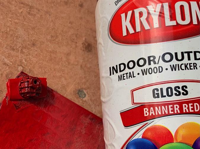
"Close enough for jazz and government work" red color on an '88-era NASCAR differential. This was after an abortive attempt to get a color closer to a rusty red out of a dead can. Turns out this Krylon color in a light coat looks good enough for me on the black plastic. Last time I built one of these stock cars in 1987, I followed Monogram's paint callout for a gunmetal color (7th photo down in this series, all I had was silver), but it turns out these tended to be reddish, as seen in this '88 Miller Regal photo collection. Oh, yeh. It'll have a definitely identifiable GM body on it, no worries about that.
-
Window net bracket (but not before dropping that dinky piece first and only guessing where it landed - successfully!) Gotta stop accumulating projects and instead complete more model cars this year. Happy New Year, everyone!